
For the average person, the words hue, tint, tone, and shade are generally used interchangeably. And this doesn’t usually cause any problems on an average day, but when you’re selecting paint colours for rooms inside your home, your exterior house colour, or your office, and depending on who you’re talking to, which word you use can make those conversations easier.
If you’re planning on hiring a house painter to give your home a fresh coat of paint, be sure to work with a team of professional painters who can get the job done right. At Integrity Painting in Winnipeg, we are passionate about providing our clients with exceptional service and detailed-oriented work. We can assure you that every corner will be flawless and each surface will get a smooth layer of paint that gives your home a beautiful appearance.

A hue is essentially the three primary colours (red, blue, and yellow) as well as the three secondary colours (orange, green, and purple). These colours are pure, meaning that white or black have not been mixed in with them. Black, white, and grey are considered neutral colours.
A good way to think about the colour wheel is breaking the colours down by using familial relationships. Primary colours are the parents, from which all of the colours can be created. To make secondary colours, the children, two primary colours are mixed together. The grandchildren are tertiary colours, which is a mixture of one primary colour plus its closest secondary colour.
When you’re looking for a colour that is lighter than a pure hue, this is achieved by adding white. When white is added to a hue, it is known as a tint. When you take red, for example, adding white will make the colour a lighter version of red. Many refer to this as reducing a colour’s brightness, but the brightness of the actually remains the same.

A tone is when just a neutral grey has been added to any hue. A neutral grey is when just black and white are mixed and not any other colour. The tone of a colour will reduce its intensity. Toned colours are often considered to be less brilliant, but also more sophisticated and visually pleasing.
The opposite of tint, a shade is when just black is added to a pure hue. This makes the original colour darker. Adding black will create a more intense colour. So when you’re painting your home, if you want to create a welcoming and relaxing atmosphere, you may want to avoid shades of colours.
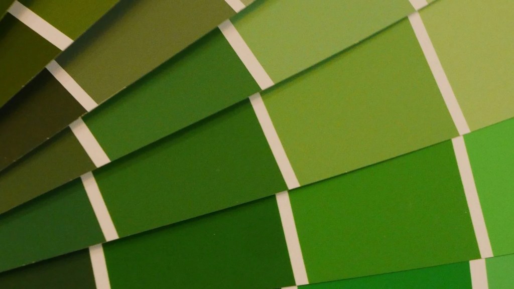
When you’re selecting paint colours for your home, there are endless variations in tints, tones, and shades. The amount of white or black that you add to a hue, or the amount of white and black used to create a grey will all have an impact on the lightness or darkness of the final colour. Overall, you’re starting with an original hue, or a pure pigment, then adding either white, black, or grey.
Need help choosing the right tint, tone, or shade for your space? Explore our interior residential painting services to see how we bring colour theory to life with flawless results.

So how do these colour concepts show up in real life?
Since 1992, Integrity Painting has been providing quality service and detail-oriented painting services throughout the Winnipeg area. From start to finish, we’ll make sure you truly love the colour inside and outside your home.
Here’s why thousands of homeowners and property managers choose us:
From drywall repair and popcorn ceiling removal to custom stucco and cabinet work, we bring integrity to every brushstroke.