
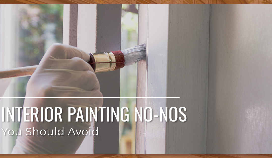
If you’re sick of staring at the same blank walls in your home, and it’s time for an upgrade, we’re ready to give your abode the facelift it needs with a fresh coat of paint. But, you may find that you’re uncertain about the best colour palette for your walls. How can you decide? After all, it can be easy to pick a few colours that clash with each other, and once your paint is on the wall, you could be left with a feeling of regret. Well, we’ve certainly seen our fair share of uncertainty here at Integrity Painting, which is why we’re taking some time today to go over a few interior painting no-nos that you can avoid. You can rest assured that you’ll love the new look of your home’s interior when you use these tips and tricks to pick your paint palette:
 Too Bright for Dark Colours
If you have a lot of light in your home, then that’s a good thing! You’ll be able to work with a wider range of colours. Just be mindful that some colours don’t perform as well in certain lights, and some colours look best in artificial light, while others look best in natural light. Be sure to test out your paint swatches in the room where they will be applied. Do the colours look good in the daylight? How do they look at night when the lights are flicked on? Take note that some spaces won’t look good if they receive lots of light and they are painted with very dark colours. These dark colours can look jarring and even dirty in bright light, so you may want to tone it back a bit if your spaces are filled with natural and artificial light.
Too Much Shadow for Light Colours
Along those same lines, you should be wary that light colours can look awkward in rooms that are dark. If you have rooms that lack windows and much overhead lighting, then you could find that the shadows are accented against lighter paint colours. Those stark contrasts can the space feel a bit spooky and unsettling for those who are in the room. Instead, opt for a more moderate hue and tone for your darkest rooms. The shadows will blend more easily into the light, and the space will feel comfortable and cozy, instead of unwelcoming.

Sweeping Your Floors Under the Rug
Don’t forget about the floors of your home! While we likely spend much of our time admiring the walls of our homes, the floors of our abodes hold equal weight, and they’re often just as expansive. This portion of your home should be considered when you’re settling on a colour palette for the walls and ceilings of your house, since it will anchor these colours to the rest of your spaces. Be sure to work with colours that compliment the colours of your floor. For instance, if you have a dark hardwood floor, you might consider deep, regal colours to compliment that high-style. On the other hand, you could opt for light colours to contrast your dark floors, giving your rooms a sense of balance. Just be sure not to use the same colour as your floors (which may prove overwhelming), or to pick a colour that is simply off-putting when it abuts your floors.
Too Bold
While bold colours are desirable for many modern styles, it’s easy to go overboard. Be wary that bold colours can be off putting for guests and those who are looking to buy your home (if you ever place it on the market), even if you cherish the colour yourself. Also, be wary that bold colours are more likely to clash with other colours throughout your home, including other colours on your walls and ceilings, your floor colours, the colours of cabinetry, and even the colours of furniture and other fixtures throughout your abode. You can still get away with an accent colour or two (and accent colours can be quite tasteful!), just take caution when you’re reaching for the boldest colour swatches.
Too Neutral
On the flip side, you can end up with a colour palette that is too neutral, which may unfortunately prove to be boring. If you’re only opting to paint your home in tans, off-whites, and greys, the neutral overload can seem depressing, or at the very least, a waste of space. Instead of wasting the opportunity to make your home more appealing with a coat of paint, you may have squandered precious wall space with monotonous colours. So, you can include a few bolder colours to make your space more lively and balance.
Fads Don’t Last
While we all may be tempted by fads from time to time, your home’s walls may not be the best place to experiment. If your considering painting your home’s walls with the latest and greatest colour palette, be warned, the excitement may be fleeting. While it’s tempting to reinvigorate the liveliness of your home with a metallic bronze colour (or whatever is the colour of the day), these investments rarely pay off in the long run, especially if you’re planning on selling your home any time soon. Instead, stick with some of those tried and true colours that you can trust you’ll enjoy for the duration of your residency in your abode.
Matching Too Much
We’ve made mention of this problem before, but we’ll address it full on here: You shouldn’t exactly match your paint colours with its surroundings. While it’s okay, and in fact a good idea to match some elements of your home, it’s easy to overdo it. Strive not to perfectly match your paint to the furniture of your home, or else it can overwhelm the aesthetic and it may look a bit contrived. Instead, you can opt for a more neutral or washed out version of that colour, thus making your furniture pop out pleasantly against a complimentary backdrop. If everything in your home ends up being the same forest green colour, you’ll lose yourself in the forest.
Get a Colour Consultation
Still can’t decide on the right colour set for your abode? Don’t fret. We’d be happy to help you out. We offer colour consultation services alongside our traditional painting services, so that you can rest assured that you’ll love the colours of your walls. We have years of experience painting homes here in Winnipeg, and that experience has lent us some know-how when it comes to tasteful paint colours. We can talk with you to determine your preferences, and we can take a look at your home to analyze the opportunities that it presents. Then, we’ll work with you to settle on a palette that you’re certain will look great. And finally, of course, we’ll get to work right away to paint your home! Feel free to get a free estimate for your project, or reach out to us if you’re curious about our colour consultation services!
Recent Comments